SPORTS DRINK REBRAND
CLIENT: ARMCHAIR MEDIA NETWORK
AGENCY: MILLS ADAMS DESIGN CO.
REBRAND SCOPE:
Discovery & Strategy, Company Naming, Identity System, Typography & Color, Custom Website Design, Social Playbook, Messaging, and more.
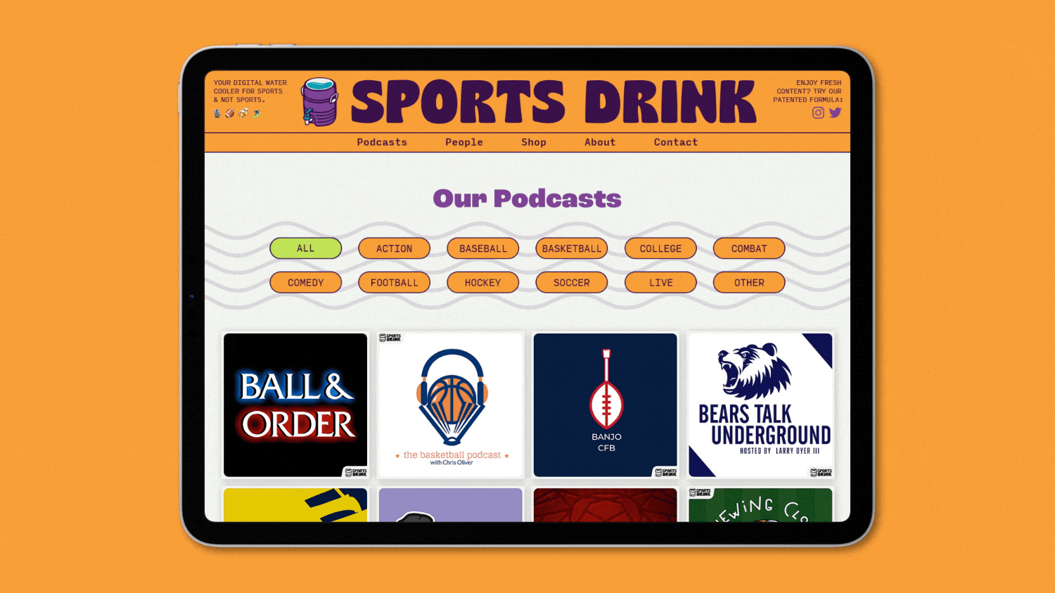
SPORTS DRINK, formerly known as Armchair Media Network, is a podcast network and content production company made up of 70+ podcasts covering sports and culture through the voices and eyes of local fans, comedians, and pro athletes (no matter how raspy or bloodshot.)
CHALLENGE/OBJECTIVE:
Develop a light-hearted brand with a unique visual identity that this generation can rally behind. Something the podcast hosts and their listeners can identify with, and also feel relevant to today’s internet culture.
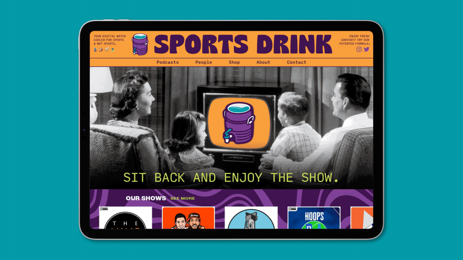
INTRODUCING, SPORTS DRINK.
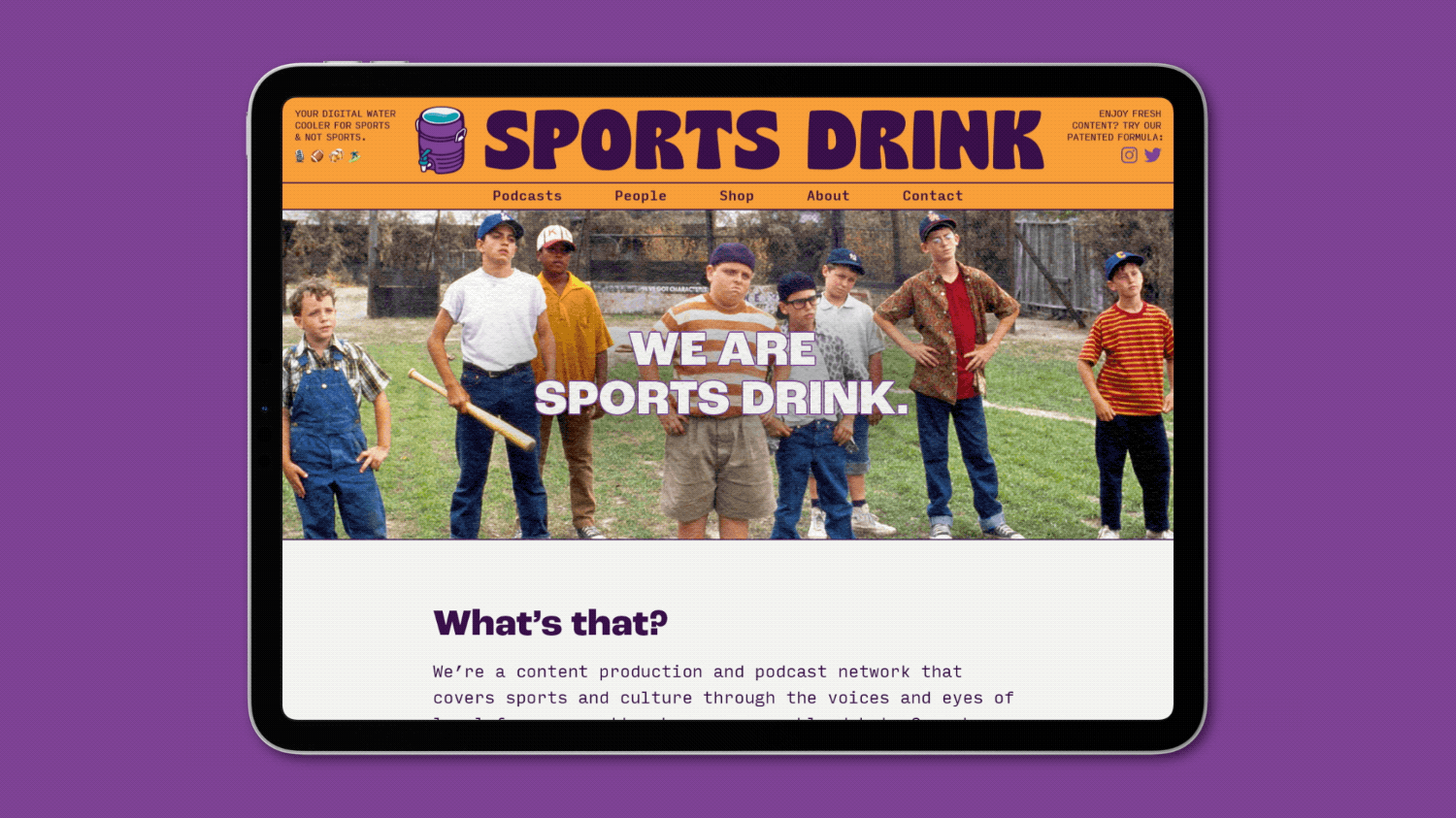
Your Digital Water Cooler for Sports, Comedy, & Culture.
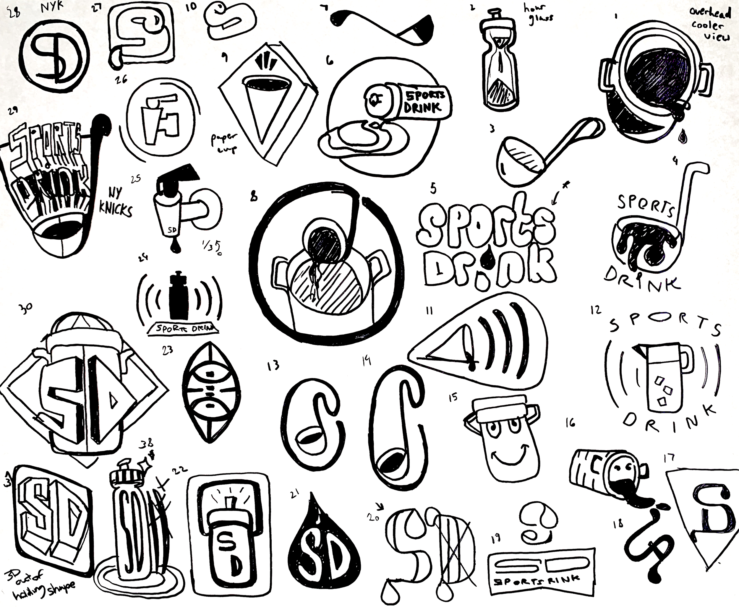
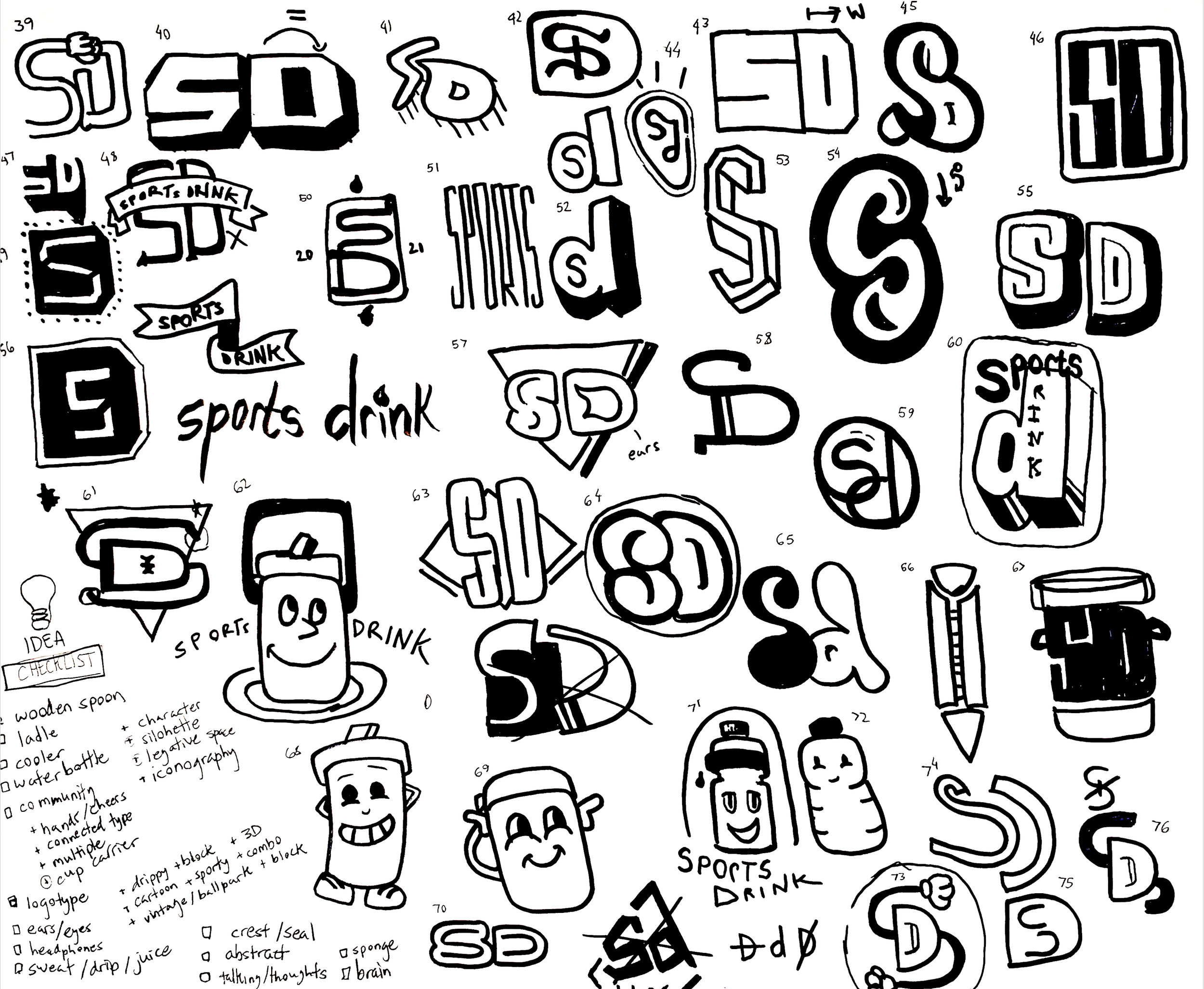
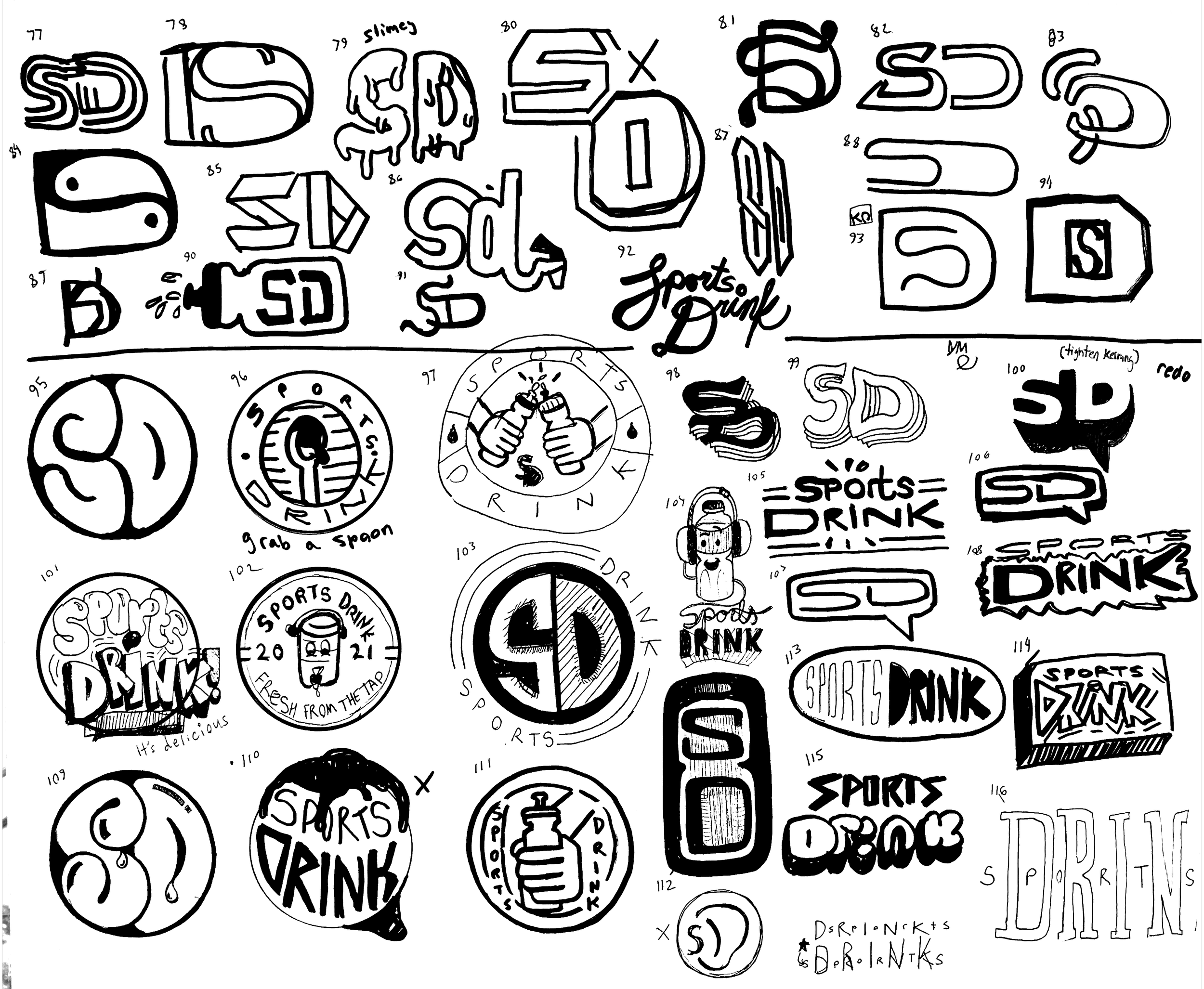
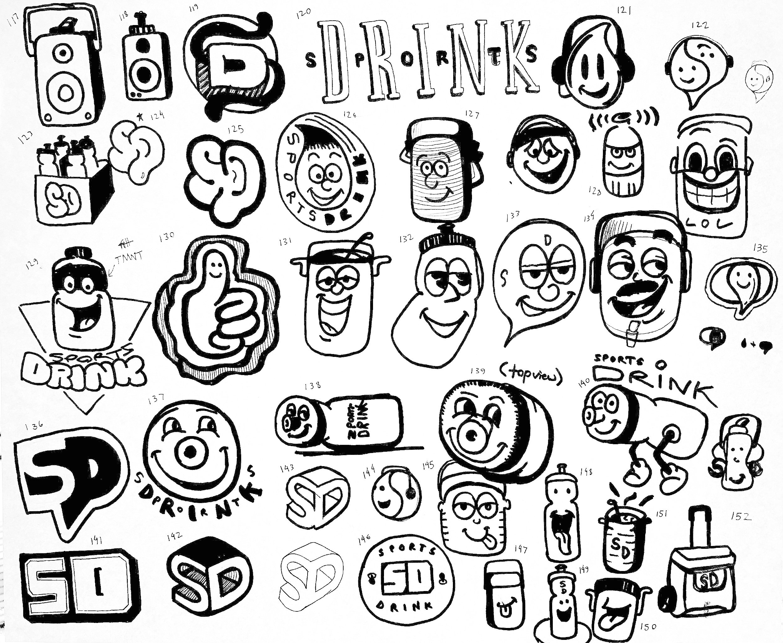
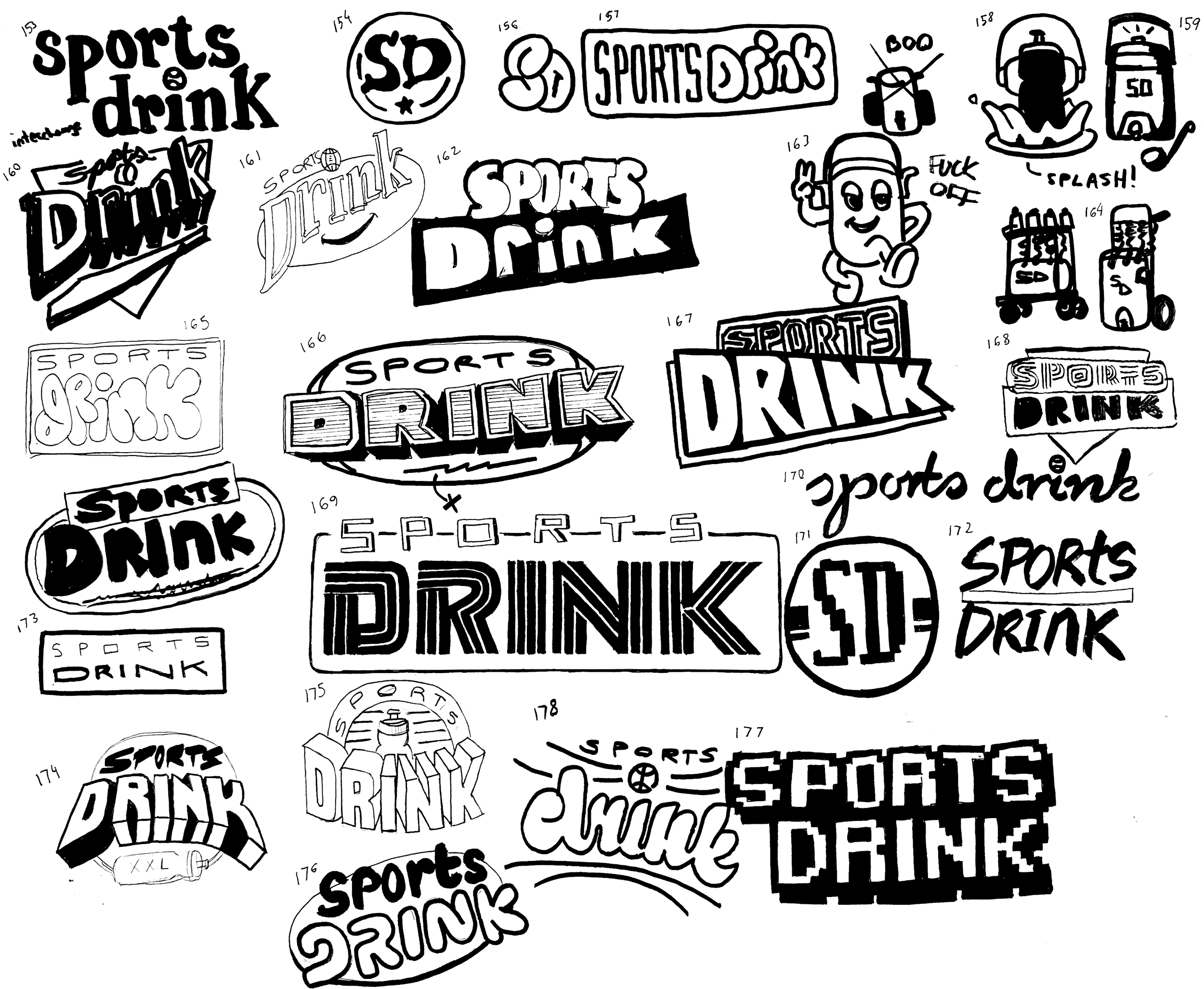
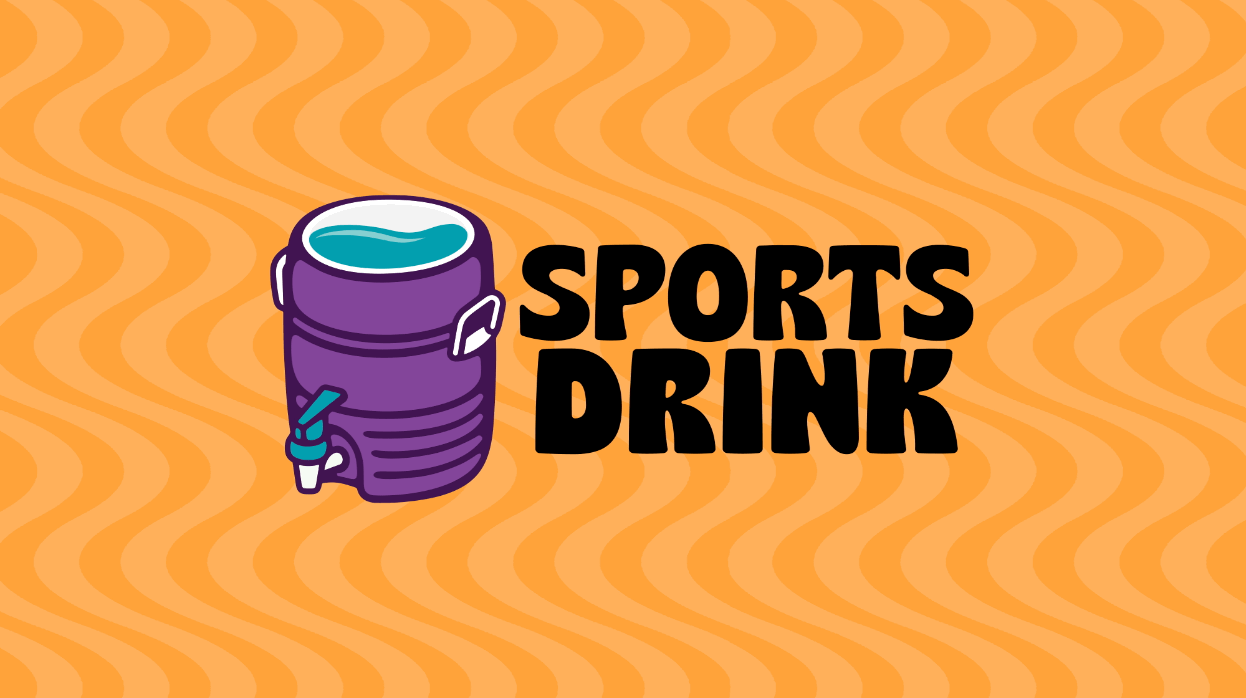
THE LOGO:
The SPORTS DRINK logo is intended to feel informal and laid back. The cooler represents community and symbolizes open conversation (a.k.a. shooting the sh*t).
The drink inside the cooler symbolizes our network's diverse personalities all mixing together to create a unique and flavorful concoction.
Ultimately, we didn’t want a traditional logo. We wanted something that would fit in amongst the many different meme and parody accounts that are popular today. Something flexible that could be easily remixed to represent a particular team’s colors or philanthropic cause.

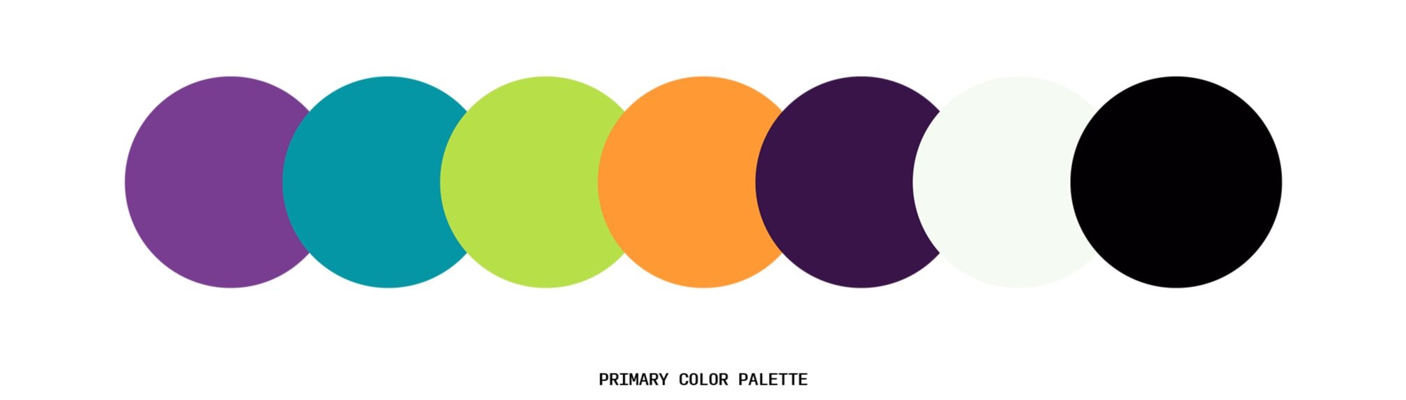
COLOR AND TYPE:
We selected a color palette that felt like it came straight out of a lunchbox from the 90’s. Something bright, nostalgic, and sporty, where each color could hold their own as a sport drink flavor.
For type, we wanted something big and bold with a lot of character and a wide variety of weights. Roc Grotesk by Kostic Type Foundry does just that. We used a monospaced font, Input Mono, for body copy and secondary headlines to maintain a “carefree” retro feel.

SPORTS DRINK
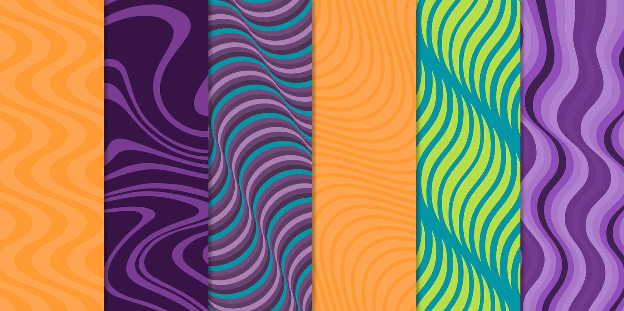
PATTERNS:
In order to create more dynamic layouts and generate movement within our social templates, we created a series of wavy patterns that mimic the fluid nature of our flavorful sports drink concoction and compliment our color palette. This rings especially true when brought to life with motion in video assets.

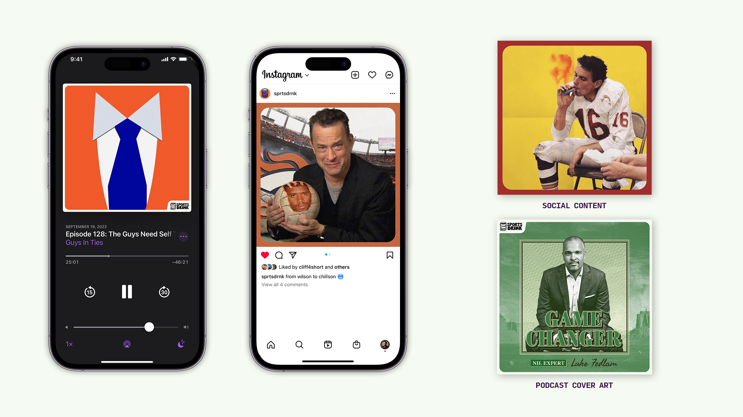
THE BORDER:
As a network and parent brand where each individual podcast is acting as its own mini-brand, the use of a branded system allows us to:
1 ― Bring a cohesive and identifiable aesthetic to our varied cover designs.
2 ― Generate awareness of SPORTS DRINK in an effort to build brand equity over time.
3 ― Bring energy to any layout or social post by adding a pop of color/texture.
4 ― Stand out amongst a crowded social timeline and “feed of sameness.”
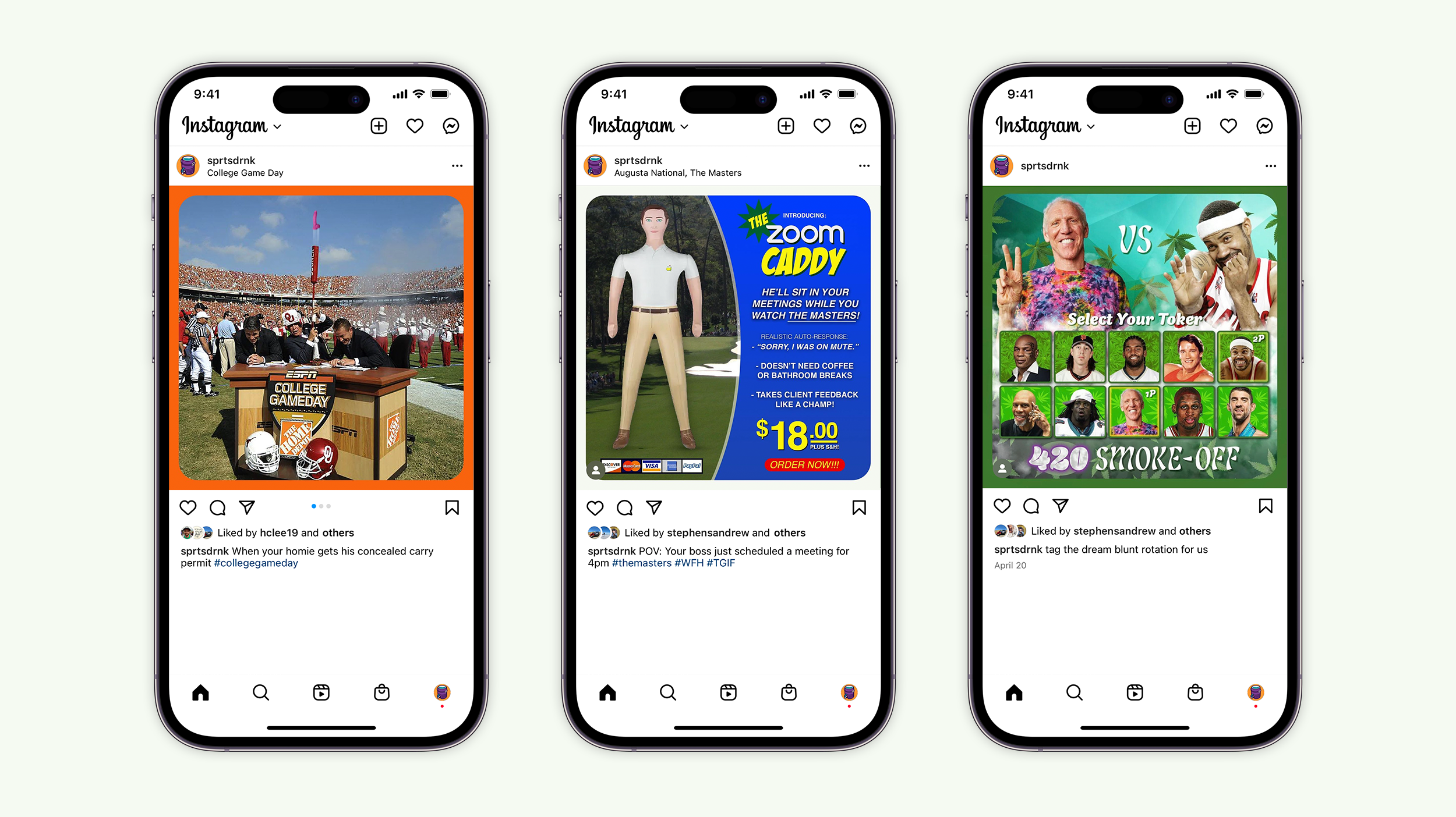
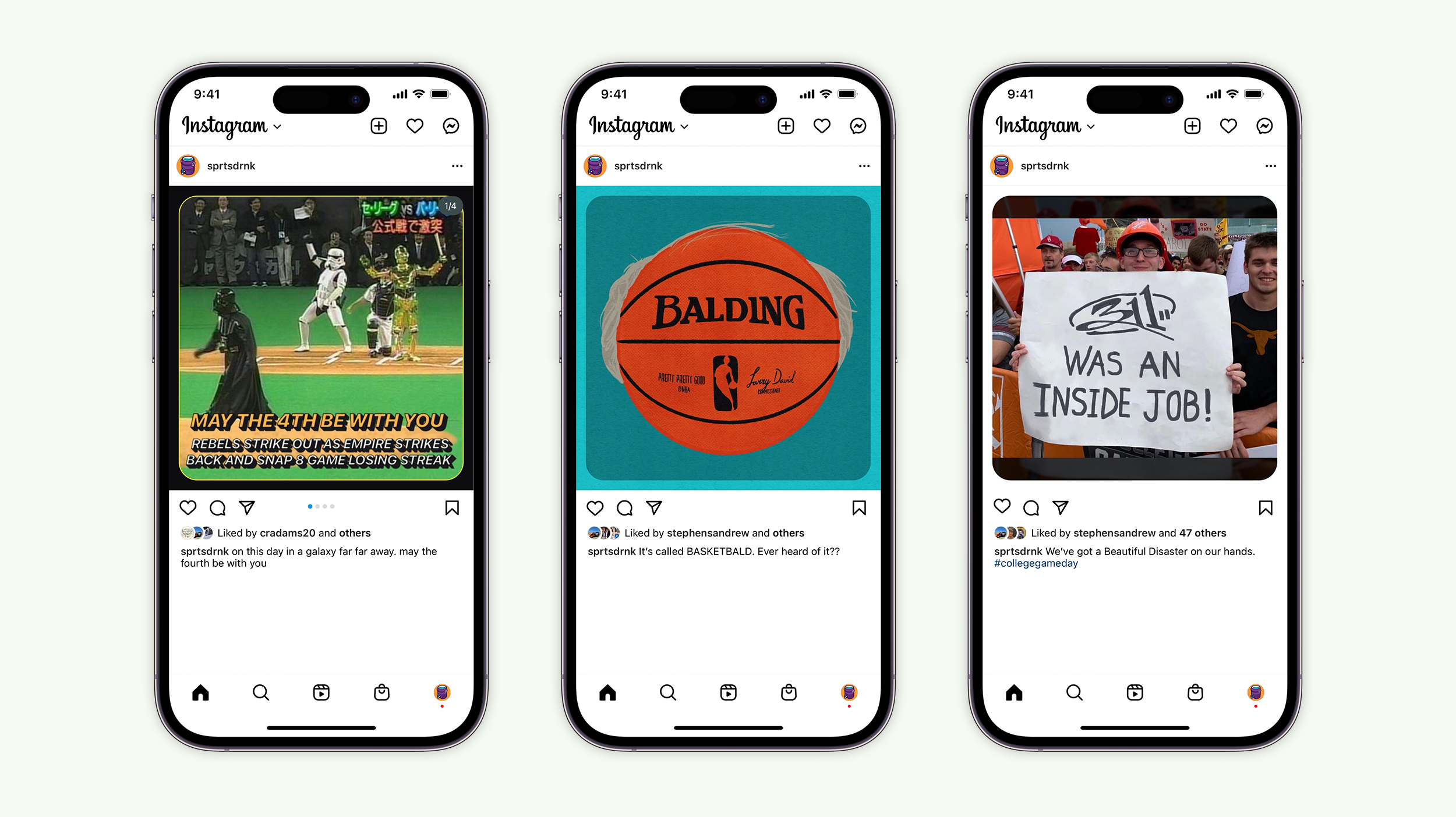
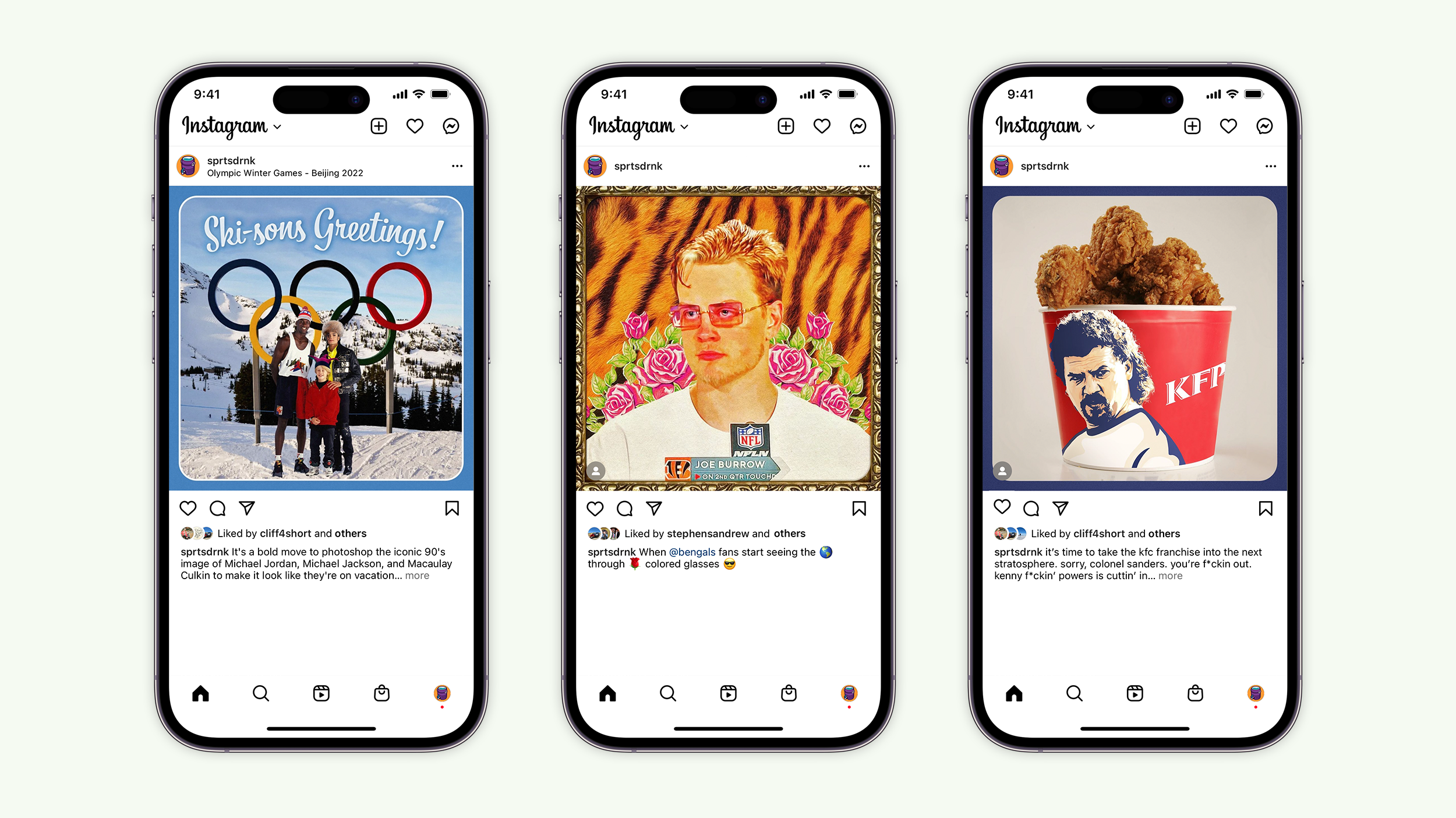
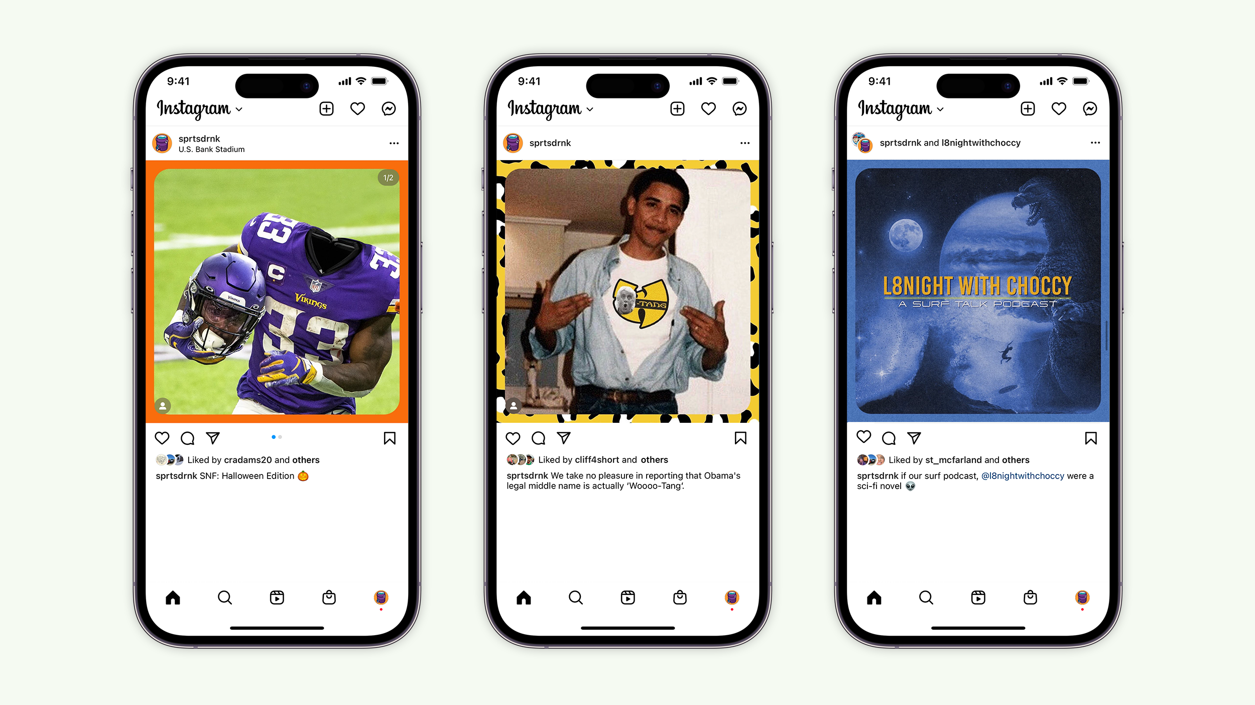
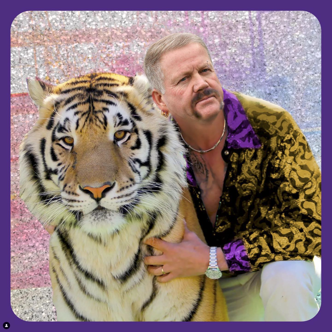
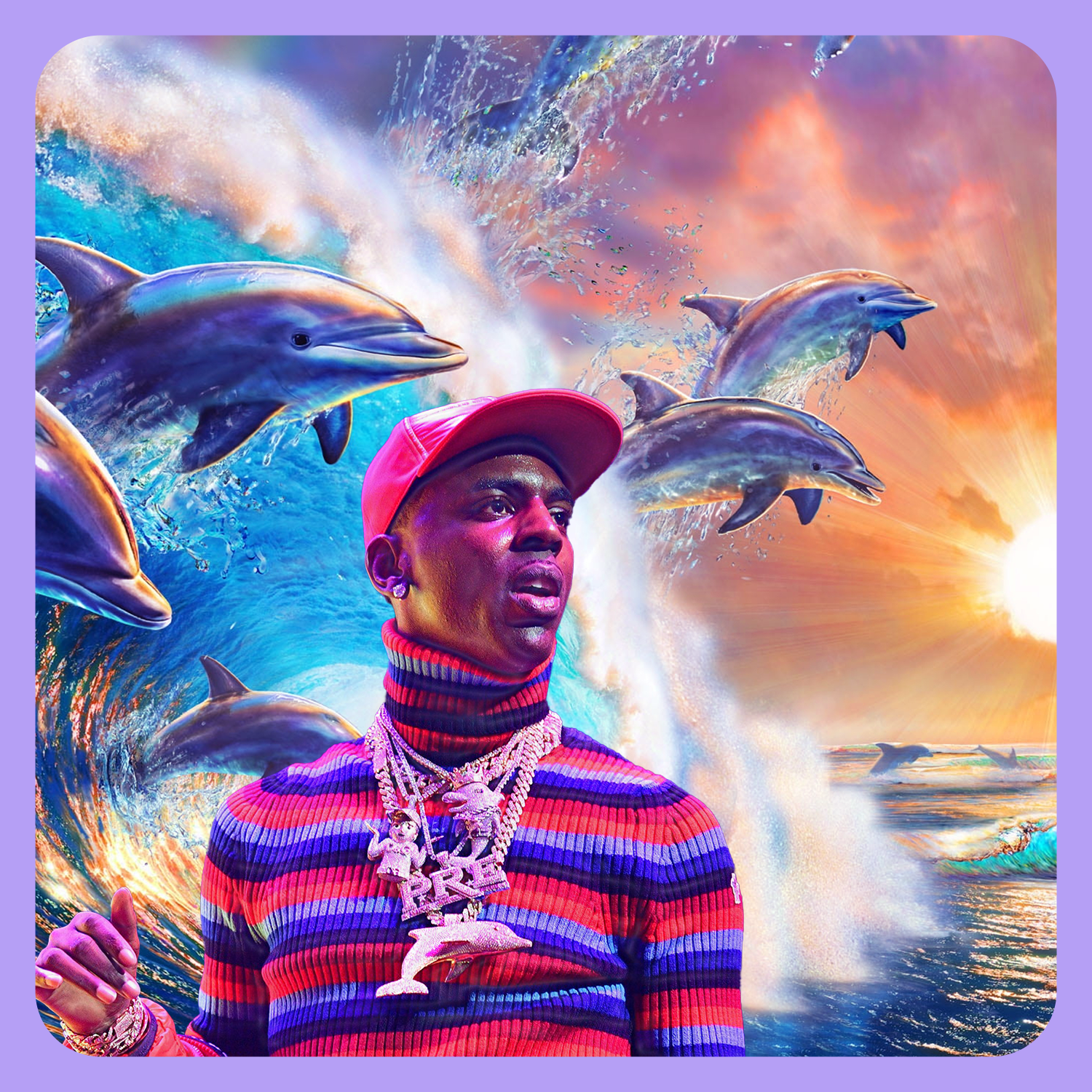
SPORTS DRINK SOCIAL:
Over time, sports coverage has gotten sterile. While the social landscape is constantly changing, we set out to create content that can always be enjoyed. We developed our own unique concoction somewhere between elevated sports memes and photoshop f*ckery to help add a little flavor to your feed.


PRESENTATION MATERIALS:

THE PROCESS:

INSPIRATION | Moodboard
DISCOVERY